We took part in a workshop where we learnt the technique of acrylic transfering. We first began by selecting pieces of our work which we could use to do this process. I wanted to use simple drawings I've done so I can work on top of the pieces and add colour, to link it back to unit 1.
The first piece I chose to do was a continuous line drawing of my car.
On the left is the original drawing I did in black biro. To create a tranfer you need to photocopy the photo to make a carbon copy, to allow it to tranfer onto the acrylic. I made two photocopies of this drawing, one in black and I did one in red too, to see how the colour would effect the outcome. I then had to choose the surfaces to print this on. I chose a vinyl tile and some black card as the two surfaces to print this on.

To begin, using a brush or palette knife, white acrylic is spread onto the surface in an even layer, not too thin. I found it hard to get am even smooth texture with a brush so I used the brush strokes to add linear marks into the acrylic. White acrylic was used to give the best background for the tranfer to show up on. Once the acrylic is on, the image is placed face down onto the paint and pressed on firmly, ensuring its all making contact with the acrylic. They were left then to dry over night.
 Once dry, I wet the paper and rubbed it to remove the paper, but gently enough to make sure the pigment remained in the acrylic. Across is the one using the red copy. I find the red lost some vibrancy during the process, but the lines were thick enough to still stand out against the white background, I find the edges of this piece looked rather messy, and between the white acrylic and the paper fragments, its washed out the black background also, giving the whole piece a washed out feel.

Next was the one I did on the flooring tile. I used horizontal brush strokes as opposed to the vertical ones on the above piece, and I find this works better with the car on the piece, giving the illusion of movement. I find the black lines complement the brown tile, also the marks in the acrylic flow with the marks and grooves in the vinyl.
I did two more experiments with this technique, first I found some camoflague fabric which I wanted to use, and a ceramic tile.

The piece across I used a line drawing of a mannequin, which was origionally in red and blue biro, but I chose to keep it black for this experiment as I feel the colours would of clashed too much. This is my favoure piece out of the four, I think the smoother acrylic, and the texture of the fabric really compement eachother, and the lines of the camoflague are similar shapes to the ones made outlines by the mannequin.

Lastly I did an experiment on a ceramic tile, I chose to photocopy a monoprint I did in two colours of the mannequin also. I kept this one in colour are the tile and acrylic were white so I thought this would make the colorus stand out more. I find this one looks very effective with the flowing lines of the mannequin which contrast the harsh change of colour down the centre, the cold blue tones right next to the warm red tones.
Overall I found this technique very interesting to use and its very quick to prepare, just the drying time can be a disadvantage. I plan on using this technique in the future to develop into unit one work.
The first piece I chose to do was a continuous line drawing of my car.
 |
| biro line drawing of my car |
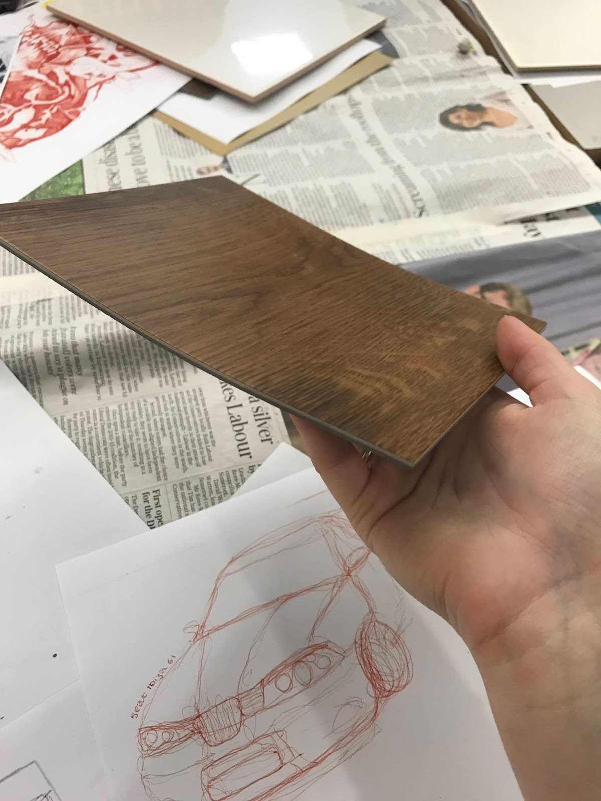 |
| vinyl tile |

To begin, using a brush or palette knife, white acrylic is spread onto the surface in an even layer, not too thin. I found it hard to get am even smooth texture with a brush so I used the brush strokes to add linear marks into the acrylic. White acrylic was used to give the best background for the tranfer to show up on. Once the acrylic is on, the image is placed face down onto the paint and pressed on firmly, ensuring its all making contact with the acrylic. They were left then to dry over night.


Next was the one I did on the flooring tile. I used horizontal brush strokes as opposed to the vertical ones on the above piece, and I find this works better with the car on the piece, giving the illusion of movement. I find the black lines complement the brown tile, also the marks in the acrylic flow with the marks and grooves in the vinyl.
I did two more experiments with this technique, first I found some camoflague fabric which I wanted to use, and a ceramic tile.

The piece across I used a line drawing of a mannequin, which was origionally in red and blue biro, but I chose to keep it black for this experiment as I feel the colours would of clashed too much. This is my favoure piece out of the four, I think the smoother acrylic, and the texture of the fabric really compement eachother, and the lines of the camoflague are similar shapes to the ones made outlines by the mannequin.

Lastly I did an experiment on a ceramic tile, I chose to photocopy a monoprint I did in two colours of the mannequin also. I kept this one in colour are the tile and acrylic were white so I thought this would make the colorus stand out more. I find this one looks very effective with the flowing lines of the mannequin which contrast the harsh change of colour down the centre, the cold blue tones right next to the warm red tones.
Overall I found this technique very interesting to use and its very quick to prepare, just the drying time can be a disadvantage. I plan on using this technique in the future to develop into unit one work.
Comments
Post a Comment