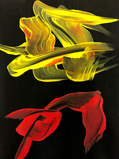
 For the second artist who I find uses colour in an interesting way, is Ed Moses. An artist who also used acrylics on canvas, like Julio Le Parc. His marks are more fluid and abstract and have more movement and energy. I'm drawn to his work as the colour scheme tends to be very simple, black background with 2/3 different colours on top. The vibrant red and yellow tones stand out massivley against the black background, and also you can tell how thick the acrylic is on the page due to the amount of black from the background showing through. This adds another layer of depth to the piece, as you can also see the brush strokes which gives the pieces more movement.
The top 2 pieces I did with just red and yellow acrylic like I saw in Moses' work, but I wanted to include more colours, so I chose to add blue to the composition. I chose blue as its the other primary colours, so complements the red and yellow well. I found that by overlapping the colours whilst they are still wet, some blending occurs between colours. This blending of colours reminds me of Le Parc's work how the small dots in his work gave the illusion of a new colour.
By doing

this it also adds more depths and layers to the piece. I wanted to do some experiments using cyan, yellow and magenta too, as those are the printer 'primary colours'. I struggled to find a pink acrylic which stood out against the black background, as when my first attempt dried, the pink can barely be seen. So I did another attempt at this but mixing my own magenta using white and red. I did this as I thought adding the white would add to the opacity over the black background. I then decided to use these colours to create another piece, but I had the same outcome once again.
 Moving on from this, I wanted to do some experiments using Moses' piece "Grid Neiu" as inspiration. I did two pieces in response to his painting. The first one I used masking tape to mask off sections in order to get the smooth crisp lines in his work. I used both yellow and red acrylic and brushed the paint on parallel to the masking tape to create linear marks. Once I did the lined in once direction, I let that layer dry and repeated in the opposite direction, creating a grid effect which layers up the colours creating depth. To add some extra marks to the piece, I used the masking tape I'd used for the lines (with acrylic on) and dabbed it onto the still wet piece. I found this added a 'distressed' look which is similar to Moses work. Reflecting on this piece, I feel the lines were too thick but I was limited due to my sketchbook being A5. To move forward, I created another piece in which I cut the thickness of the masking tape in half in order to fit more lines onto the page.
I found this to be more time consuming and needed more preparation than the previous attempt. However, I feel the overall look of the piece is better. There is more lines, or a tighter grid, which allows for more lines to be layered. I used different thicknesses of acrylic in order to add depth and create some transparency too. I did the same dabbing effect with the masking tape onto this piece too as I found it very expressive, and broke up the harsh lines.
Moving forward, I want to do more experiments with simple colours palettes but in different ways, such as developing my acrylic transfer prints to use more colour.

Comments
Post a Comment