
Large Scale Contour Workshop

As part of a workshop, I took a drawing which I had done, which I felt would look good on a large scale, and began by making a sellotape transfer. The drawing I used was a fineliner sketch in which was one of my drawings for inktober. I used this one as the skull had simple contours, which I felt would translate well onto a larger scale. I felt this as it was in black and white, had no shading and a variety of dark and light areas. I also felt that the cross hatching I did instead of shading would translate well on any scale. To make a sellotape transfer, I had to photocopy the image I wanted, and then place sellotape over the top, ensuring it overlaps.

Once I had done this, I took some water, and wet the paper side and rubbed the paper off. It somes off and leaves the ink from the photocopier on the sellotape, creating a transparent copy of the image. I used the projector to project my drawing onto the wall, where I'd stuck up a sheet of large paper. I then decided to use a blue sharpie to outline the main contours of the piece. When drawing the main contours, I added a small amount of shading, and cross hatching to add some depth to the piece.

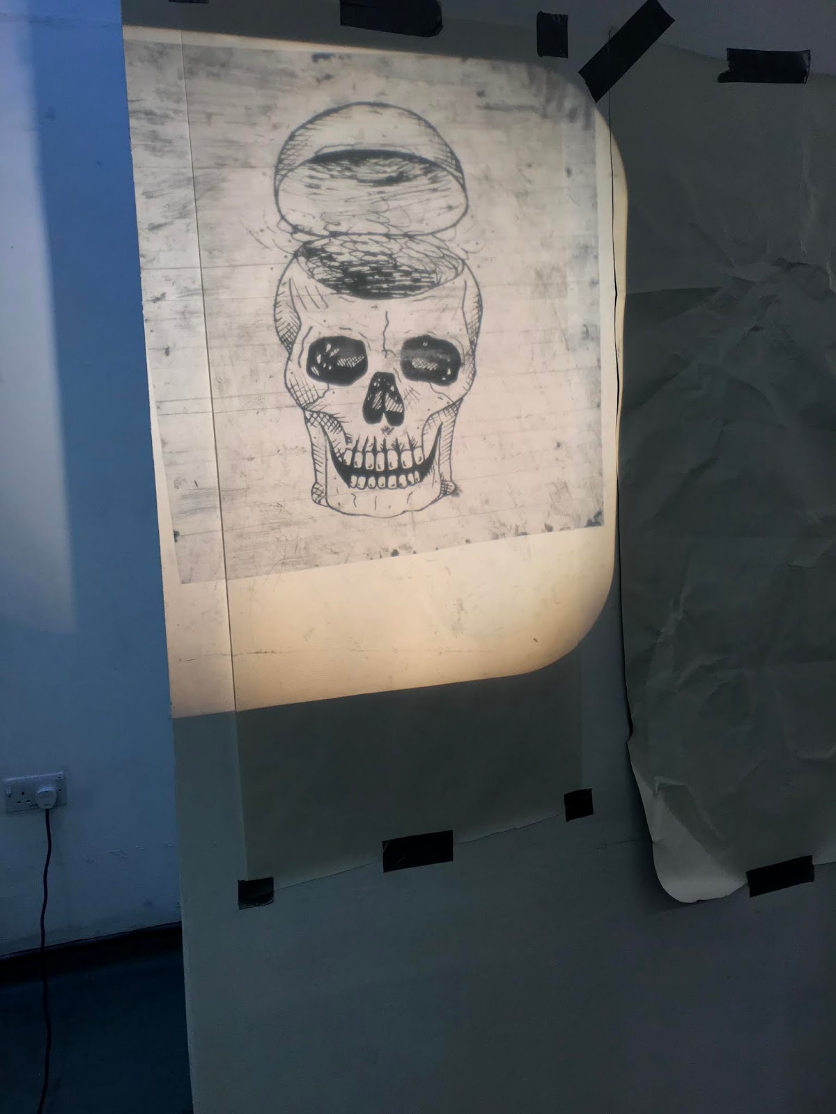
Once I had done this, I then layered up some tissue paper, I used red and blue to give the feel of classic 3D glasses. I then added a layer of acetate on top of the drawing and the tissue paper. Then using a black sharpie, I outlined the whole piece again to add another layer ontop. These 3 layers add a lot of depth and demention to the piece. The texture of the tissue paper gives more shadows, and when the light hits the ink, it casts a shadow back onto the paper, giving several outlines on the skull.


Comments

Popular posts from this blog

Refining Colour Experiments

When looking back at the experiments I did influenced by Ed Moses, I wanted to refine these as I felt they could have been done in a better way. Some of the pieces I did look rather forced and I wanted to re-visit them. I began by evaluating the types of paint I used for certain pieces. For the strongest pieces, I used a cheaper acrylic, which dried matt and was less pigmented, and for the other ones, I used a glossier acrylic with more pigment. This meant it was harder for the brush strokes to be seen against the black background and the vibrancy of the colours was too high. I decided to use the acrylic which was weaker in pigment in order to get more transparency between the colours and the black background. I used a wider brush too, which gave me more texture in the marks created by the acrylic. I used marks with more movement than before, as the fluidity of the marks mixed with the texture of the brush strokes added a lot more energy to the piece. I then did another piece using...

Still Life Drawings

 When we did observational drawings of the still life, I used a variety of drawing techniques to capture the shapes. First I used white pen on black paper, in 10 minutes this was the outcome, I just stated off by drawing everything in front of me, just capturing the main lines, without much detail, just as a warm up. Next, I moved closer and looked at a small section of the still life, and spent 10 minutes focusing on light and dark, and adding more detail. I used a variety of pencils to try and add more depth to the piece also. I found by using the brown paper it made it easier to add shadows as it looks less harsh than it would have looked on white paper. The next piece I did was in biro, on very thin white paper. I spent 10 minutes using continuous lines. I found this quite relaxing to do, as it was more abstract in the approach, as I could just squint my eyes and scribble with the pen, I was able to create both light and dark tones, which were able to blend quite ea...